Have you ever slipped into a favorite top, looked in the mirror, and felt that something just wasn’t right? Your skin might have appeared a bit dull, your eyes more tired than usual, or your face less vibrant overall. Often, the issue isn’t the cut or the fabric—it’s the color.
Colors interact with our complexion in powerful ways. While some shades enhance natural radiance, others can unintentionally drain it. As we age, changes in skin tone and contrast mean that certain colors no longer flatter us the way they once did. The good news? Small adjustments can make a noticeable difference.
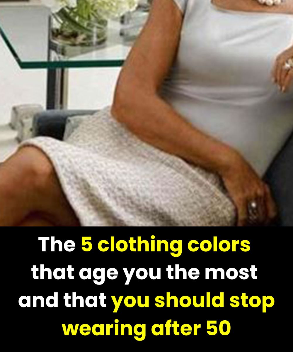
Why Some Colors Feel Less Flattering After 50
Over time, skin tends to lose some of its natural contrast and luminosity. Colors that are too dark, too pale, or overly intense can reflect light in ways that emphasize shadows or flatten facial features. When this happens, the face may look more tired or less fresh.
Choosing the right shades can instantly brighten your appearance—almost like a natural glow boost.
Below are five colors that may be worth reconsidering, especially when worn close to the face.
1. Black: Classic, but Sometimes Too Harsh
Black is timeless, slimming, and always stylish. However, near the face it can create strong contrasts that highlight shadows or make features look more severe.
Try instead: Wear black farther from the face, or soften it with light-colored scarves, jewelry, or makeup. Charcoal or soft gray can also be gentler alternatives.
2. Very Dark Navy: Elegant Yet Heavy
Deep navy is often chosen as a softer substitute for black, but when it’s extremely dark, it can have a similar dulling effect.
Try instead: Opt for brighter blues like royal blue, indigo, or peacock tones. These shades keep the elegance while adding freshness.
3. Pastels: Soft, but Sometimes Too Faint
Pastels feel light and airy, but they can lack enough contrast against mature skin, making the complexion appear washed out.
Try instead: Choose slightly richer versions—think soft coral, raspberry, or a more saturated sky blue. Pastels also work well as accents rather than main pieces.
4. Khaki Green: Trendy, Not Always Flattering
Khaki is stylish and modern, but its muted tone can sometimes make the face look tired or ashen.
Try instead: Fresher greens like sage, light olive, or emerald. These shades reflect light better and add warmth to the complexion.
5. Neon Colors: Fun, but Overpowering
Neon shades are bold and energetic, but their intensity can draw attention to fine lines or shadows when worn near the face.
Try instead: Use neon colors in accessories—shoes, bags, or scarves—so you get the pop of color without overwhelming your natural glow.
Final Thought
Style has no age limit, and color rules are never absolute. The key is awareness. By choosing shades that reflect light softly and complement your complexion, you can enhance your natural radiance at any stage of life—effortlessly and confidently.