Viral Tattoo Sparks Online Debate Over Its Hidden Message
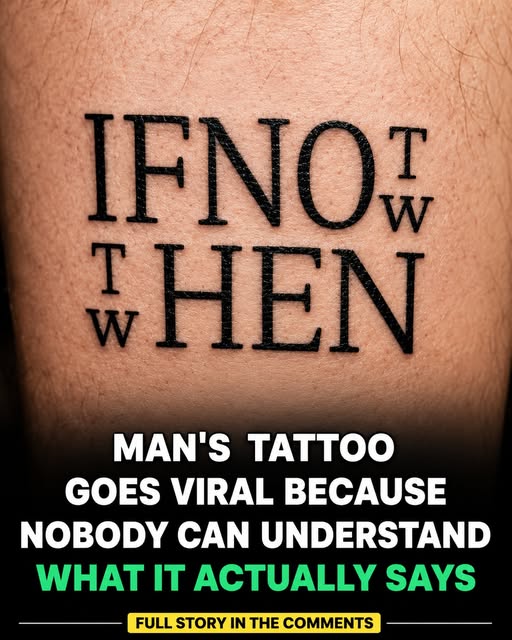
A tattoo designed to share a simple motivational message has unexpectedly captured attention across social media for a very different reason: many people can’t immediately figure out what it says. What was meant as personal inspiration became a collective puzzle, and the internet could not look away.
A Message Hiding in Plain Sight
At first glance, the tattoo appears to feature a quote written in bold, block-style lettering. However, the words are arranged in a creative and unconventional layout, making the message difficult to read. Letters stack, overlap, and interlock in ways that defeat the eye’s normal left to right scanning.
As images of the tattoo spread online, viewers found themselves studying the design for several minutes before understanding the text. Screenshots circulated with captions like “I’ve been staring at this for ten minutes” and “someone please tell me what this says.” The harder it was to read, the more people shared it.
The Internet Tries to Decode It
The unusual artwork quickly became a topic of discussion. Social media users shared screenshots, guesses, and interpretations, with many offering different readings of the message. Some believed there were multiple phrases hidden within the design, while others compared it to a puzzle or visual brain teaser.
Theories multiplied. Was it two messages layered together? A foreign phrase? A name rendered abstractly? Each new guess spawned threads of debate, with users annotating the image, tracing letterforms, and arguing over individual characters. The tattoo had accidentally become one of the internet’s favorite collaborative mysteries.
The Answer: “If Not Now, Then When?”
After extensive discussion, many users eventually agreed that the tattoo reads: “If not now, then when?” The popular quote is often used as a reminder to take action and pursue goals without unnecessary delays.
It is a fitting message for a tattoo: permanent, personal, and meant to be carried for life. The phrase, with roots in ancient wisdom literature, urges the reader to stop postponing and start doing. That the message itself is about taking action made the whole episode deliciously ironic. Thousands of people spent hours not taking action, just staring at a tattoo about taking action.
Still Hard to Read
Even after learning the intended message, some people admitted they still found the design challenging to read. Knowing the answer and seeing the answer are different things when the lettering fights your visual system. Others praised the tattoo’s creativity, arguing that its unique appearance encourages viewers to spend more time reflecting on the quote.
Both reactions have merit. A tattoo that forces you to slow down and study it arguably delivers its motivational message more deeply than one you glance at and forget. The effort of decoding becomes part of the meaning.
Why Some Designs Defy Reading
The viral image highlights an interesting aspect of visual communication: design choices can greatly influence how a message is received. Several factors made this tattoo so hard to parse:
- Unconventional layout: Words arranged vertically, diagonally, or in grids break normal reading patterns
- Interlocking letterforms: Letters sharing strokes or overlapping create ambiguity about where one ends and the next begins
- Bold, blocky style: Heavy lettering reduces the distinctive features that help us recognize characters quickly
- Missing context cues: Without word spacing or punctuation in expected places, the brain cannot chunk text normally
- Figure ground confusion: It becomes unclear which shapes are letters and which are decoration
Professional typographers spend careers balancing creativity with legibility. This tattoo leaned hard into creativity, and legibility paid the price.
The History of Hidden Message Art
This tattoo belongs to a long tradition of art that hides messages in plain sight:
- Ambigrams read differently when rotated or mirrored
- Calligrams form images from arranged text
- Steganography in art conceals messages within larger designs
- Optical illusion lettering has decorated everything from album covers to street art
What the internet did collectively, annotating and debating, is what humans have always done with puzzling images. The only difference is scale and speed.
Lessons for Tattoo Design
For anyone considering lettering tattoos, this viral moment offers practical wisdom:
- Test legibility first. Print the design, show it to friends, and see if they can read it without hints.
- Consider aging. Tattoos blur and spread over years. A design that is barely readable when fresh will only get harder to read.
- Balance art and message. If the words matter most, prioritize clarity. If the visual impact matters most, accept the mystery.
- Think about placement. Curved body surfaces distort lettering further.
- Embrace the conversation. Some people love having a tattoo that sparks discussion. If that is you, lean in.
Why We Love a Good Visual Puzzle
The tattoo’s journey from personal art to viral debate reveals something about human nature. We are drawn to mysteries we can solve with our own eyes. No special knowledge required, just looking, until suddenly it clicks. That “aha” moment delivers a small dopamine hit, and sharing it extends the pleasure.
As the discussion continues, the tattoo serves as a reminder that creative designs can sometimes be just as memorable as the messages they are meant to convey. Perhaps more memorable. After all, millions of people now know the phrase “If not now, then when?” not from a book of quotations, but from a tattoo they struggled to read.
Frequently Asked Questions
What does the viral tattoo say?
After extensive online debate, most viewers agreed it reads “If not now, then when?”, a popular motivational quote about taking action without delay.
Why is it so hard to read?
The bold, block-style lettering is arranged in an unconventional layout with interlocking letterforms, breaking the normal left to right reading patterns our brains rely on.
Was the confusing design intentional?
The design appears to prioritize artistic creativity, though whether the extreme difficulty was deliberate is unclear. The artist may have valued visual impact over legibility.
What can we learn from it about visual communication?
That design choices dramatically affect how messages are received. Creativity and clarity exist in tension, and pushing too far toward one sacrifices the other.
Should I get a hard to read tattoo?
If you love the artistic look and enjoy the conversations it starts, go for it. But test legibility with friends first, remember tattoos blur with age, and prioritize clarity if the words themselves matter most to you.